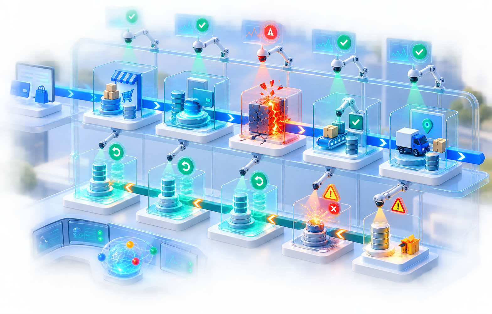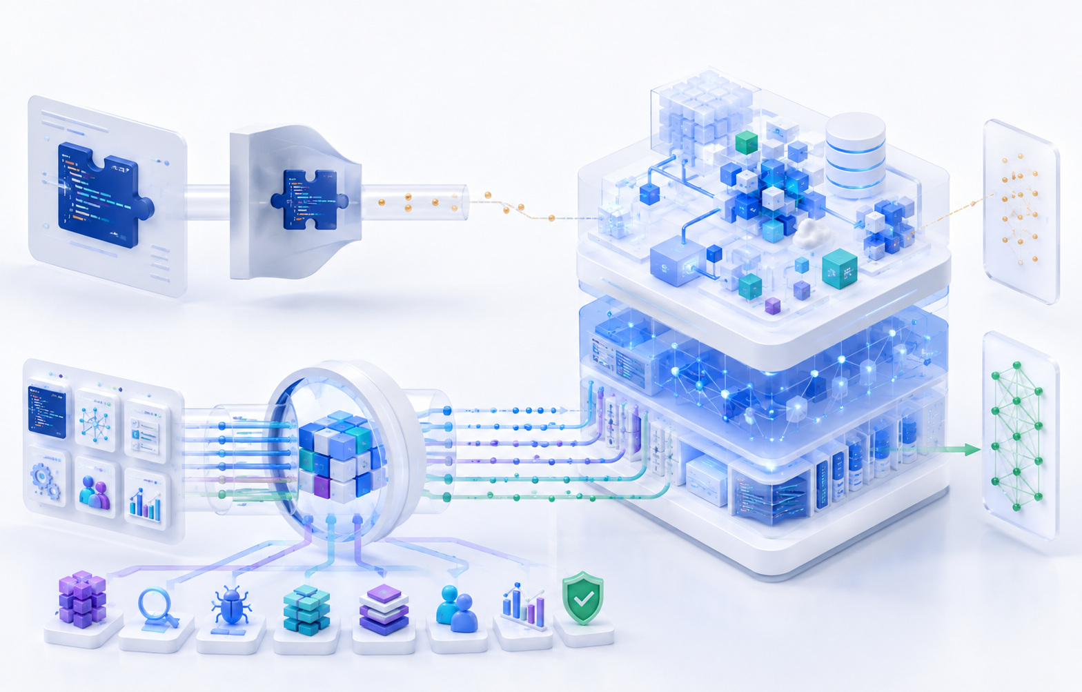
A workflow is not reliably available when its completion depends on a mouse, a visual cue, an unannounced state change, or a viewport the customer does not use. Infrastructure availability answers one question: did the server respond. It does not answer the question that actually determines whether a business transaction succeeded: could the person on the other end finish what they came to do. A signed-in user staring at a form they cannot operate is not experiencing a slow feature. They are experiencing an outage that a status page will never show, because nothing crashed. The server returned 200. The interface rendered. And the task still failed.
This is the premise behind accessibility testing as a discipline that belongs inside release engineering rather than beside it. Reliability, in the sense that platform teams already use the word, means a system does what it is supposed to do, when it is asked to do it, for the population it is built to serve. That population is not homogeneous. It includes people who navigate by keyboard because a mouse is unusable for them, people who rely on a screen reader to convert an interface into speech or braille, people who magnify their browser to two or three hundred percent because standard text is unreadable at default size, and people who complete forms with voice commands because typing is inaccessible or exhausting. None of these are edge cases in the sense of being rare exceptions to a stable rule. They are ordinary operating conditions that a production interface either supports or does not.
Reliability Ends Where the User Can No Longer Continue
Production reliability, as most engineering organizations define it, blends server response time, error rate, and uptime. Those measures describe whether infrastructure is delivering a response. They say nothing about whether the response, once delivered, can actually be used to complete a task. A checkout page can load in under a second, return no server errors, and pass every functional test in a continuous integration pipeline, while still being impossible for a keyboard user to submit because focus never reaches the payment button, or impossible for a screen reader user to complete because the credit card field has no accessible name. In both cases the infrastructure performed correctly. The workflow still failed.
It is useful to separate the layers that together make a digital product usable. Server availability confirms that a request receives a response. Interface rendering confirms that markup, styles, and scripts execute without throwing an exception. Component operability confirms that each individual control — a button, a menu, a date field — can be activated using the input method the person is actually using. Workflow completion confirms that a sequence of steps, taken together, can be carried out from start to finish. Understandable feedback confirms that the person knows what happened after they acted, whether that is a success message, a validation error, or a change in an account balance. Error recovery confirms that when something goes wrong, the person can identify the problem and fix it without abandoning the task. A system can succeed at the first two layers and fail at any of the remaining four, and from the point of view of someone trying to get work done, only the failure matters.
The absence of a JavaScript exception is frequently treated as proof that an interface is working, because it is the signal most testing infrastructure already watches for. It is not proof of operability. A dropdown built from a <div> with a click handler will not throw an error when a keyboard user tabs past it without being able to open it — it will simply sit there, visually present, functionally absent for that person. A modal dialog that opens without moving focus will not throw an error either; a sighted mouse user will see it appear and click into it, while a screen reader user will keep hearing the page content behind it, unaware anything opened. Neither of these defects appears in an error log. Neither trips an alert. Both remove a person's ability to proceed.
Accessibility testing, in this context, is not a separate discipline layered on top of quality engineering. It is the portion of testing that asks whether the interface remains operable when the assumptions embedded in most manual and automated test suites — a mouse, full vision, typical hearing, a large viewport, fine motor control — do not hold. Those assumptions are rarely written down, which is exactly why they survive so many rounds of testing unexamined. A test script that says "click Save" already presumes a person who can see the Save button, position a pointer over it, and register the visual confirmation that follows. Replace any one of those assumptions and the same script, executed by a person instead of a script runner, may not succeed.
None of this implies that every accessibility defect deserves the same response. A decorative icon with a slightly verbose accessible name is not equivalent to a submit button a screen reader user cannot locate. A missing alt attribute on a background image used purely for visual texture is not equivalent to missing error messaging on a payment form. Severity depends on what the defect blocks, whether a workaround exists, and how many people encounter the affected path. Treating every finding as a five-alarm production incident helps no one and tends to produce alert fatigue that causes real blockers to be deprioritized alongside cosmetic ones. What does deserve consistent urgency is any defect that prevents a person from authenticating, entering required data, understanding an error, or confirming that a consequential action succeeded — because those are the same categories of failure that would trigger an incident review if they were caused by a backend outage instead of an inaccessible interface.
The Browser Delivers More Than Pixels
Most conversations about "the interface" implicitly mean the visual layout: the arrangement of buttons, fields, and text that a sighted person sees on screen. That layout is only one output the browser produces. Alongside the rendered visual page, the browser constructs a Document Object Model, or DOM — the structured tree of elements, attributes, and text that JavaScript manipulates and that CSS styles. And in parallel with both, the browser builds a second structure specifically for assistive technology: the accessibility tree.
The accessibility tree is a simplified, semantically annotated representation of the page. For every element that is exposed to it, the browser computes a role — what kind of thing this is, such as button, link, heading, or checkbox — an accessible name — the label a person would hear or read to identify the element — and, where relevant, a state or value, such as whether a checkbox is checked, whether a menu is expanded, or what value a slider currently holds. The tree also encodes relationships, such as which label belongs to which input, and it reflects a reading order that assistive technology traverses independently of how the page looks visually. Screen readers, braille displays, and other assistive technologies interact primarily with this tree rather than with the pixels a sighted user sees. A screen reader does not "look at" a webpage and describe what it sees the way a human assistant might; it queries the browser's accessibility APIs and speaks or renders whatever those APIs report. If information exists only in a visual treatment — a red border, a bold label, a color change — and was never encoded into the accessibility tree, it does not exist for that user, regardless of how obvious it appears on screen.
This is why native HTML elements carry outsized importance in accessible engineering. A <button> element arrives with a role of button already assigned, receives keyboard focus automatically, responds to both Enter and Space by default, and is announced correctly by every mainstream screen reader without additional code. A <div> styled to look identical, with a click handler attached, has none of that built in. It has no role unless one is added, no keyboard behavior unless behavior is written, and no guarantee that a screen reader will treat it as anything other than an inert block of text. The visual similarity between the two is total. The underlying capability is not. This gap — between what a component looks like and what it structurally is — explains a large share of the defects that surface in accessibility evaluation, because visual design tools and component libraries make it trivially easy to reproduce the appearance of a native control without reproducing its behavior.
The same logic extends across the common vocabulary of interface elements. Links are for navigation and should carry an href; buttons are for actions within the current context. Headings, marked with <h1> through <h6>, communicate a document's structure to assistive technology the same way visual hierarchy communicates it to sighted readers, and screen reader users frequently jump between headings as a primary navigation strategy rather than reading a page linearly. Landmarks — regions such as <nav>, <main>, and <header>, or their ARIA equivalents — let a screen reader user jump directly to the navigation, the main content, or a search region instead of tabbing through every element in sequence. Form controls need programmatically associated labels, not merely nearby text. Native <table> markup with <th> elements lets a screen reader announce which column and row heading applies to a given cell, something no visual table styling can substitute for. Lists marked with <ul>, <ol>, and <li> are announced with their count and position, giving a screen reader user a sense of how much content is ahead. Dialogs, menus, tabs, and comboboxes are more complex composite patterns, each with expected keyboard behavior that a sighted mouse user never has to think about because the mouse makes it unnecessary.
Accessible Rich Internet Applications, generally referred to as ARIA, exists to describe semantics and state for interface patterns that HTML does not natively provide — a tab panel, a live region, a custom combobox. ARIA attributes such as role, aria-expanded, aria-selected, and aria-describedby let a developer tell the accessibility tree what a custom component is and what state it is currently in. What ARIA does not do is implement behavior. Adding role="button" to a <div> tells assistive technology to announce the element as a button. It does not make the element focusable, and it does not make Enter or Space activate it — that behavior has to be added separately, correctly, and tested. This distinction matters because ARIA is sometimes treated as a universal repair mechanism, applied to make a non-conforming pattern "technically" labeled correctly while the underlying interaction remains broken. Incorrect or excessive ARIA can make an interface less understandable than no ARIA at all: a role that misrepresents what an element does, or a state that never updates, actively misleads a screen reader user rather than merely failing to help them. The W3C's own guidance on ARIA authoring reflects a consistent principle: use a native HTML element with the required semantics and behavior built in whenever one exists, and reach for ARIA only when there is no native equivalent, applying it precisely and testing the result with real assistive technology rather than assuming correctness from the markup alone.
Input Is a Production Dependency
Every step of a typical account-management workflow — signing in, locating a record, opening an edit view, entering data, responding to validation, submitting, and confirming — can be described purely in terms of visual steps a mouse user takes. Rewritten for a keyboard-only user, the same workflow depends on an entirely different set of guarantees, none of which are automatically present just because the visual design looks correct.
The first guarantee is a logical tab order — pressing Tab moves focus through interactive elements in an order that matches how the page is meant to be understood, typically the same order a sighted reader would scan the page visually. When developers use CSS to reposition elements without adjusting the underlying DOM order, or when a component's markup is generated in an order that does not match its visual placement, tab order and reading order diverge, and a keyboard user experiences the page as jumping unpredictably between unrelated regions. The second guarantee is visible keyboard focus — an indicator, typically an outline or highlighted border, showing which element currently has focus. This indicator is disabled more often than almost any other accessibility feature, usually because a developer or designer found the browser's default focus ring visually unappealing and removed it with outline: none without providing any visible replacement. Removing that outline does not remove focus; it removes the only way a sighted keyboard user can see where they are on the page.
Buttons and links need to be operable with Enter, and in the case of buttons, Space, matching native behavior. Custom menus need to open with Enter or Space, allow arrow-key movement between items, and close with Escape while returning focus to the control that opened them. Select-style controls need equivalent keyboard operability whether they are native <select> elements or custom comboboxes. Expandable sections need a control that communicates its expanded or collapsed state and that keyboard users can trigger without a pointer. Dialogs need a defined way to close using the keyboard, and that mechanism needs to be reachable — a close button that exists visually but sits outside the tab sequence a keyboard user can reach is not actually available to that user. Date pickers, which are almost always custom-built because no native element covers every desired interaction, are a frequent point of failure: calendar grids that only respond to a mouse click, with no arrow-key navigation between days and no way to select a date without pointing at it.
Data grids compound this difficulty because they often need to support both navigating between cells and entering an editing mode within a cell, using overlapping key combinations that require careful, deliberate implementation rather than defaults. Drag-and-drop interactions — reordering a list, moving a card between columns, resizing a panel — are built around a physical gesture that has no keyboard equivalent unless one is explicitly added, typically in the form of move-up and move-down buttons, or a keyboard-operable alternative announced through instructions. WCAG 2.2 formalized this expectation with a success criterion generally referred to as Dragging Movements, which requires that any functionality achieved through a dragging motion also be achievable through a single pointer action without dragging, such as a tap or click, unless dragging is essential; the underlying accessibility need — a non-drag alternative for reordering, resizing, or repositioning — applies equally to keyboard-only interaction, since keyboard input has no drag gesture at all.
Keyboard traps deserve particular attention because they turn a difficult experience into an unrecoverable one. A trap occurs when focus enters a component — commonly a poorly implemented modal, a rich text editor, or an embedded widget — and the keyboard user has no way to move focus back out using standard navigation keys. Unlike a missing label, which slows a person down, a keyboard trap can strand them entirely, forcing a page reload and the loss of any unsaved work.
Touch, switch, and voice input each add further requirements. Touch input benefits from adequately sized targets; WCAG 2.2's Target Size (Minimum) criterion generally calls for interactive targets to be at least 24 by 24 CSS pixels, or to have sufficient spacing from neighboring targets, with defined exceptions for inline text links and cases where an equivalent, appropriately sized control is available elsewhere — exact thresholds and exceptions should always be checked against the current WCAG 2.2 specification or the WCAG 2.2 Quick Reference rather than assumed from memory, since implementation details vary by context. Switch users, who operate a device through one or a small number of physical switches paired with scanning software, depend on the same clean focus order and keyboard operability that benefits keyboard users generally, since switch access is typically built on top of the same underlying interaction model. Voice control software, such as tools that let a person say a visible label to activate the corresponding control, depends on the accessible name of an element matching, or at minimum containing, its visible label text — a pattern WCAG 2.2 addresses through the Label in Name requirement. When a button displays "Submit" but its accessible name is programmatically set to something unrelated, such as a generic "Confirm action," a voice control user saying "click Submit" will find nothing to activate, even though the button is fully visible and would work perfectly for a mouse user.
A common but insufficient response to keyboard defects is adding tabindex="0" to a non-native element and considering the job finished. tabindex="0" inserts an element into the natural tab order, but it does nothing else: it does not assign a role, does not enable Enter or Space to activate the element, does not provide any visible focus styling, and does not implement the arrow-key or Escape behavior that a menu, dialog, or listbox pattern requires. Making an element reachable by keyboard is the first of several requirements, not a substitute for the rest.
Focus Is Application State
Keyboard focus is frequently treated as a cosmetic detail — a visual ring that appears around whatever element happens to be selected. In an accessible interface, focus functions as application state, comparable in importance to a form's validation state or a modal's open-or-closed state, because focus determines what a keyboard or screen reader user will interact with next and what they believe is currently active on the page. Managing it deliberately, rather than letting the browser's default behavior dictate it, is one of the more consistently underestimated engineering requirements in interactive product work.
Consider a dialog that opens when a user clicks an "Edit record" button in the composite workflow. When that dialog opens, focus needs to move into it — typically to the dialog's heading or to its first interactive control — so that a keyboard or screen reader user is immediately oriented inside the new context rather than left wherever they were on the page behind it. While the dialog is open, focus generally needs to remain contained within it, so that pressing Tab repeatedly cycles among the dialog's own controls instead of leaking back into the page content behind an overlay the user cannot currently see or interact with meaningfully. When the dialog closes — whether through a Cancel button, an Escape keypress, or successful submission — focus needs to return to a sensible location, most often the control that originally opened the dialog, so the user's position in the page is preserved rather than reset to the top.
Each of these decisions has failure modes that are common in production software. If initial focus is not moved into the dialog, a screen reader user may not realize anything opened at all, since the dialog's content sits outside their current reading position. If focus is not contained, a keyboard user can tab out of a modal into background content that is visually obscured, becoming lost in a part of the page they cannot see. If focus is not returned after closing, it frequently defaults to the very beginning of the document — the browser's fallback when the previously focused element is no longer present — forcing the user to tab all the way back down to where they were, which is disorienting and slow, particularly on content-heavy pages. If the record being edited is deleted while it holds focus, and no replacement focus target is assigned, focus can be lost entirely, leaving some browsers and assistive technology in an ambiguous state.
Single-page applications introduce a comparable problem at the level of full route changes. When a user navigates from a list of records to a specific record's detail view without a full page reload, the browser does not automatically move or announce anything, because from the browser's perspective no new document was loaded. Without explicit handling, a screen reader user may hear nothing change at all despite an entirely new view having replaced the old one. A common and reasonable pattern is to move focus to the new view's primary heading and to ensure the page's title updates, giving both visual and non-visual users a clear signal that navigation occurred. This does not mean sending focus to the very top of the page after every micro-update — doing so for every minor content refresh, filter change, or autosave creates a disorienting experience of its own, repeatedly yanking a user's position away from what they were doing. Focus movement should correspond to genuinely new contexts: a route change, a dialog opening, or a major mode change, not every asynchronous update a page performs.
Popovers, menus, and non-modal overlays raise similar but distinct questions, since they typically should not trap focus as aggressively as a true modal dialog, and closing them — whether by selecting an item, pressing Escape, or clicking elsewhere — should return focus predictably rather than leaving it stranded on an element that has since been removed from the DOM. Loading states deserve attention as well: if a save action disables the submit button while a request is in flight, and that button currently holds focus, disabling it can silently drop focus from the page entirely in some browser and assistive technology combinations, again defaulting to an ambiguous position. A more resilient pattern keeps the control focusable but visually and programmatically indicates a busy state, or deliberately manages where focus goes if the control truly must be removed.
Validation failures are a frequent point where focus management determines whether an error is discoverable at all. If a form submission fails and the page re-renders with error messages inserted near the offending fields, but focus is not moved to the first error or to a summary of errors, a screen reader user may have no indication that anything went wrong beyond a possible, easily missed status announcement. A sighted mouse user scans the page and notices red text; a screen reader user needs focus, an announcement, or both, deliberately directed toward the failure.
Visible focus and programmatic focus are related but not identical concepts, and conflating them causes real defects. Visible focus refers to what a sighted user can see — an outline or highlight. Programmatic focus refers to which DOM element currently holds focus according to the browser, which is what determines what a screen reader announces and where subsequent keystrokes are directed, regardless of whether anything is visually indicated. It is possible to have an element that is programmatically focused but has no visible indicator, which strands sighted keyboard users even though a screen reader user may still be well oriented. It is also possible, through certain implementation mistakes, to apply focus styling to an element via CSS :hover or a class toggle without ever actually moving programmatic focus there, which creates the appearance of a functioning interface for automated visual review while leaving keyboard and screen reader behavior entirely broken.
The following example shows one credible way to implement an accessible dialog, illustrating several of the decisions described above. It uses native HTML with minimal ARIA, since a <dialog> element already carries built-in semantics in modern browsers, and pairs it with JavaScript to manage the interactions the element does not provide automatically.
<button id="edit-trigger">Edit record</button>

<dialog id="edit-dialog" aria-labelledby="edit-dialog-title">
  <h2 id="edit-dialog-title">Edit record</h2>
  <form method="dialog">
    <label for="record-name">Name</label>
    <input id="record-name" name="name" type="text" />
    <button type="submit">Save</button>
    <button type="button" id="cancel-edit">Cancel</button>
  </form>
</dialog>

<script>
  const trigger = document.getElementById('edit-trigger');
  const dialog = document.getElementById('edit-dialog');
  const cancelBtn = document.getElementById('cancel-edit');
  let lastFocused = null;

  trigger.addEventListener('click', () => {
    lastFocused = document.activeElement;
    dialog.showModal(); // native modal behavior: focus enters, background is inert
    document.getElementById('record-name').focus();
  });

  function closeDialog() {
    dialog.close();
    if (lastFocused) lastFocused.focus(); // focus returns to the invoking control
  }

  cancelBtn.addEventListener('click', closeDialog);
  dialog.addEventListener('close', () => {
    if (lastFocused) lastFocused.focus();
  });
</script>
The native <dialog> element's showModal() method already makes background content inert to assistive technology and contains focus within the dialog while it is open, which removes the need to hand-build a focus trap. The script still has to move initial focus to a sensible starting point inside the dialog, and it still has to store and restore the previously focused element, because the browser does not do either of those automatically. Every production implementation needs to be verified with an actual keyboard and an actual screen reader rather than assumed correct from the code alone, since browser support and default behavior for native elements can vary and evolve. The WAI-ARIA Authoring Practices Guide documents comparable patterns for dialogs, menus, and other composite widgets and should be treated as implementation guidance to be adapted and tested, not as code to copy verbatim into production without verification.
The Same Interface Can Produce a Different Screen Reader Product
Two interfaces that look identical to a sighted user can produce entirely different experiences for a screen reader user, because what a screen reader announces is built from headings, landmarks, labels, descriptions, relationships, roles, states, and status messages — none of which are visible in a screenshot. This is one of the more difficult ideas to internalize for teams whose review process is built around visual comparison, because the artifact that determines pass or fail for a sighted reviewer — how the page looks — is largely disconnected from the artifact that determines the experience for a screen reader user.
Unlabeled controls are among the most common failures. An icon-only button — a trash can for delete, a pencil for edit, a magnifying glass for search — communicates its purpose visually through a widely recognized symbol, but a screen reader has no way to interpret an icon's meaning unless an accessible name is explicitly provided, typically through visually hidden text, an aria-label, or an accessible SVG title. Without it, a screen reader announces the control simply as "button," with no indication of what pressing it would do. A page with several icon-only buttons, all announced identically as "button," forces a screen reader user to activate each one experimentally to discover its function, or to abandon the task rather than risk an unintended action such as deletion.
Repeated ambiguous link text produces a related problem. A page with several "Learn more" or "Read more" links, each pointing to a different destination, is easy for a sighted user to disambiguate because surrounding visual context — a nearby headline or image — makes each link's target obvious. Screen reader users frequently navigate by pulling up a list of all links on a page, presented out of visual context, and a list containing ten identical "Learn more" entries provides no way to tell them apart. The fix is not necessarily to change the visible text, which might be a legitimate design choice, but to ensure each link's accessible name is distinct, commonly through visually hidden text appended to the link or an aria-label that includes the specific destination.
Heading hierarchy that does not represent the actual structure of the content creates a different kind of disorientation. Screen reader users frequently jump between headings to get an overview of a page before reading it in detail, similar to how a sighted user might visually scan a page's headline structure. If headings skip levels arbitrarily, are chosen for their default font size rather than their structural role, or are entirely absent on a content-heavy page, that overview mechanism collapses, and the user is forced back into linear reading of the entire page to find what they need.
Custom widgets — comboboxes, sliders, star ratings, rich toggle switches — are common sources of incorrect state announcement. A toggle switch built from a styled checkbox generally inherits correct checked and unchecked announcement automatically. A toggle switch built entirely from <div> elements with custom styling needs role="switch" and aria-checked explicitly managed in code, updated every time the visual state changes; if the visual state updates through a CSS class but the aria-checked attribute is never touched, a screen reader will announce a state that no longer matches what is visually true, actively misinforming the user rather than simply failing to inform them.
Content visually hidden with certain CSS techniques, such as display: none or visibility: hidden, is correctly removed from the accessibility tree along with its visual removal, which is usually the intended behavior for things like closed accordion panels. Content hidden using only visual tricks that do not affect the accessibility tree — for instance, positioning an element off-screen with negative margins while leaving it otherwise rendered — can remain exposed to screen readers even though it is invisible on screen, producing confusing announcements of content the sighted experience never shows. The reverse failure is just as common: content that remains visible to sighted users but has been accidentally removed from the accessibility tree, often through an aria-hidden="true" attribute applied too broadly to a parent container that also contains meaningful, visible content.
Table structure without correctly associated headers is a frequent barrier in data-heavy SaaS interfaces. A visually styled grid of rows and columns, built without <th> elements or with headers that are not programmatically connected to their data cells, forces a screen reader user to hear a stream of unlabeled values with no indication of which column or row each belongs to, even though the visual alignment makes the relationship obvious to a sighted reader.
Form instructions disconnected from their fields are another recurring pattern: instructional text such as "must be at least eight characters" that sits visually near a password field, but is not associated with that field through aria-describedby, is read by a sighted user glancing nearby, and is entirely skipped by a screen reader user tabbing directly to the field.
Verbosity and duplication are failures in the opposite direction. Overly aggressive use of ARIA attributes, redundant labeling that repeats the same information through both visible text and an aria-label, and live regions that announce the same status message multiple times in quick succession create a noisy, exhausting experience that can be as much of a barrier as missing information, because it buries meaningful content in repetition the user has to filter out mentally.
It is worth stating plainly that screen readers differ from one another, and the same underlying HTML and ARIA can be announced somewhat differently depending on which screen reader is paired with which browser. NVDA paired with Firefox, JAWS paired with Chrome, VoiceOver on macOS or iOS, and TalkBack on Android each have their own interpretation logic, particularly around complex ARIA patterns, and a pattern that behaves correctly in one combination is not automatically guaranteed to behave identically in another. This is not a reason to treat screen reader testing as unreliable or optional; it is a reason to test with more than one representative combination for genuinely critical paths, and to recognize that a single passing test with a single screen reader is evidence, not universal proof. Screen reader output is also not a complete definition of accessibility on its own — a page can announce cleanly through a screen reader while still being unusable by keyboard alone, difficult to operate at high zoom, or overwhelming for someone with a cognitive disability, which is why screen reader evaluation is one input among several rather than a stand-in for the whole discipline.
A Form Is Reliable Only When Failure Is Recoverable
Forms are where the composite workflow's reliability is most concretely tested, because entering required information, responding to validation, and submitting a change is the step where a person commits data and depends on the interface to confirm, correct, or explain what happened next. A form that collects data correctly under ideal conditions but leaves a person unable to recover from a mistake is not a minor usability shortfall; it is a workflow that fails under exactly the conditions — a typo, a missed field, an expired session — that real usage guarantees will eventually occur.
Persistent, programmatically associated labels are the foundation everything else depends on. A label connected to its input through the for and id attributes, or by wrapping the input inside the <label> element, is announced by a screen reader whenever the field receives focus, and is also clickable by a mouse user to move focus into a small checkbox or radio button — a usability benefit for motor-impaired and sighted users alike. Placeholder text, the gray hint text that appears inside an empty field, is not a reliable substitute for a label. Placeholders disappear the moment a person begins typing, offering no ongoing reference to what a field is for if a person needs to double back; they frequently fail typical color contrast requirements because they are styled to look muted and secondary; and depending on how a browser and screen reader interact, they may or may not be announced at all when a field is focused. A field identified only by a placeholder is a field with no reliable label.
Required-field communication needs to be conveyed through means other than color or an asterisk that only a sighted user notices, typically through the required attribute or aria-required, paired with a visible textual cue. Instructions that apply to a field — a password's minimum length, an expected date format, a character limit — need to be programmatically associated with that field, usually via aria-describedby, so a screen reader user hears them at the same point a sighted user would see them, not disconnected as page text encountered separately or not at all. Input purpose, addressed by WCAG 2.2 through Redundant Entry and by earlier WCAG versions through input purpose identification, is supported by using correct autocomplete attribute values on common fields like name, email, and address, which lets browsers and assistive technology offer autofill and reduces the burden of retyping information a system may already have.
Grouping related fields — such as billing address components, or a set of radio buttons representing a single choice — inside a <fieldset> with a <legend> gives a screen reader user a spoken introduction to the group's purpose before hearing each individual option, comparable to how visual grouping and a section header communicate the same relationship to a sighted user.
Error identification is where color-only signaling most commonly fails. A field outlined in red, with no accompanying text, communicates an error exclusively through color, which is unavailable to users with certain forms of color vision deficiency and entirely unavailable to screen reader users regardless of their vision. An accessible error needs to be represented in text, associated with its field, and ideally accompanied by a specific, actionable suggestion rather than a generic "invalid input" — telling a person that a phone number needs to be ten digits is meaningfully more useful, and more likely to lead to successful resubmission, than telling them only that the field is wrong.
Errors can also be visually present while remaining unavailable to assistive technology, a subtle but common defect. If an error message appears in the DOM correctly but is not associated with its field through aria-describedby, and is not announced through a live region or focus movement when it first appears, a sighted user notices the new red text immediately while a screen reader user, already positioned elsewhere on the page, may never encounter it unless they happen to navigate back to that exact field afterward.
Handling focus after a failed submission deserves care rather than a single universal rule applied blindly. Moving focus to the first invalid field, or to a summary list of errors positioned near the top of the form, gives the user an immediate, direct path to what needs to be fixed. A summary approach tends to work better for forms with many simultaneous errors, since it lets a person see the full scope of what is wrong before addressing each item; moving focus directly to the first error tends to work better for shorter forms where a single mistake is the likely case. What matters most is that focus moves somewhere meaningful and that the destination is announced, rather than leaving a keyboard or screen reader user positioned wherever they happened to be when the failed submission occurred, with no indication that anything changed.
Status messages and error announcements rely on aria-live regions, role="alert", and related mechanisms, each with different appropriate uses. A live region marked aria-live="polite" waits for a natural pause before announcing its content, appropriate for status updates like "changes saved" that should not interrupt whatever the user is currently doing. role="alert", which implies an assertive live region, interrupts immediately and is appropriate for urgent, time-sensitive information such as a session about to expire, but overusing it for routine, non-urgent messages creates a jarring, interruptive experience. Overuse of live regions generally — applying them to every minor UI change, or updating them multiple times in rapid succession during something like a live-validating field — produces repeated or overlapping announcements that bury the message a user actually needs among noise they do not.
Preventing accidental submission and providing a review step before consequential actions — deleting a record, changing a password, making a payment — protects every user from mistakes, and is particularly important for anyone whose interaction method makes precise input more effortful, since a confirmation step gives a chance to catch an error before it becomes permanent. Timeout and session-expiration behavior deserves the same care: a session that silently expires while a person is composing a long-form response, without warning or a way to extend it, can destroy unsaved work regardless of how the person is interacting with the page, but the consequences fall hardest on anyone for whom re-entering that data is slower or more effortful the second time.
WCAG 2.2 formalizes two relevant expectations. Redundant Entry generally asks that information a user has already provided during a process not be requested again in the same process unless necessary, such as for security, or unless the previously entered information is no longer valid — a common violation is a multi-step checkout that asks for a shipping address and then, on a later step, asks for the same address again with no auto-fill or reuse. Accessible Authentication generally asks that a cognitive function test — solving a puzzle, transcribing an image, recalling a memorized password without support — not be the only way to complete an authentication step, unless an alternative exists or a mechanism assists the user, recognizing that some memory- and pattern-based tests present a barrier disproportionate to their security value for people with certain cognitive disabilities; exact wording, exceptions, and conformance level should be confirmed against the current WCAG 2.2 text rather than paraphrased from a secondary source, since exceptions are specific and matter.
The following compact example illustrates a correctly associated label, an instruction, and an error relationship for a single field within a larger form, along with a status region for a submission-level message.
<form novalidate>
  <div role="status" aria-live="polite" id="form-status"></div>

  <label for="email">Email address</label>
  <input
    id="email"
    name="email"
    type="email"
    aria-describedby="email-hint email-error"
    aria-invalid="true"
  />
  <p id="email-hint">We will send confirmation to this address.</p>
  <p id="email-error">Enter an email address in the format name@example.com.</p>

  <button type="submit">Save changes</button>
</form>
The aria-describedby attribute references both the hint and the error, so a screen reader announces both when the field receives focus. aria-invalid="true" is applied only while the error is active, communicating the field's current validity state without relying on color. The role="status" region near the top of the form can be updated with a brief confirmation, such as "Changes saved," after a successful submission, using aria-live="polite" so it does not interrupt whatever the user is doing at the moment it appears. None of this replaces visual styling — the field would still typically show a red border and icon for sighted users — it ensures the same information is available through the accessibility tree as well.
Dynamic Interfaces Need Observable State Changes
Modern SaaS interfaces rarely reload a full page for every action. Saves happen asynchronously in the background, totals update the instant a quantity changes, search suggestions appear as a person types, and toast notifications slide in and out to confirm an action succeeded. Every one of these patterns assumes a sighted user watching the screen closely enough to notice a visual change the instant it happens. That assumption does not hold for a screen reader user, who has no way to detect a purely visual change unless the interface explicitly communicates it through the accessibility tree.
A visual change that goes unannounced is, from a screen reader user's perspective, indistinguishable from nothing having happened at all. If a person edits a field in the composite workflow and the interface silently saves the change in the background with only a brief toast notification as confirmation, a sighted user notices the toast appear and fade; a screen reader user, unless that toast is implemented as a live region, has no way of knowing whether the save succeeded, failed, or was even attempted. The same applies to a shopping cart total that updates the instant a quantity field changes, a list of search results that refreshes as a person types into a filter box, or a progress indicator that silently completes.
The appropriate response is not to move keyboard focus to every dynamic update, which would be disorienting, interrupting whatever the person was doing to yank them toward unrelated content each time a background process finished. The more reliable pattern is a status message, delivered through an aria-live region, that describes what changed without moving focus away from where the user currently is. A cart total updating after a quantity change is well suited to a polite live region announcing something like "Total updated to $84.00," heard without interrupting continued interaction with the quantity field. A destructive or urgent change, such as a session about to expire or a save that failed outright, may warrant a more assertive announcement, or in some cases deliberate focus movement to a dedicated message, because the consequences of missing it are higher.
There is a meaningful difference between moving focus to new content, announcing a status without moving focus, updating an existing control's state so it is discoverable the next time the user interacts with it, and simply allowing content to be discovered through the user's own subsequent navigation. Each is appropriate in different circumstances. Moving focus is warranted for genuinely new contexts, such as a dialog opening or a route change. A live region announcement is warranted for background updates the user should know about but should not be forced to stop and address immediately. Updating a control's own state — for instance, changing a toggle's aria-checked value, or a button's aria-expanded value — is sufficient when the user will naturally re-encounter that control and does not need an interrupting announcement in the moment. Relying purely on the user discovering a change through their own subsequent navigation is appropriate only when the change is genuinely low-priority and not something the interface has any particular obligation to surface proactively.
Infinite scrolling and dynamically inserted rows in a data table raise a related challenge: content that a sighted user perceives as "the page getting longer" as they scroll is, structurally, new DOM content being appended, and a screen reader user navigating linearly may not have any clear signal that new content has arrived versus that they have simply reached what they believed was the end. Live collaboration features — another person editing the same record simultaneously — introduce updates that originate entirely outside the current user's own actions, which are especially easy to miss without deliberate status handling, since nothing the user did locally explains why content just changed.
Notification overload deserves explicit caution. An interface that wires up a live region for every minor state change — every keystroke in a live-validating field, every autosave tick, every hover state — produces a stream of announcements that a screen reader user experiences as constant interruption, often leading them to disable or tune out live regions entirely, at which point even the important announcements stop being heard. Restraint in what gets announced, and at what frequency, is as much a part of correct implementation as making sure the important announcements happen at all.
Testing an asynchronous status update requires observing the accessibility tree directly rather than relying on a screenshot or a passing network request. A representative manual check for the cart-total example above would involve triggering the quantity change with a screen reader active, confirming that a spoken or brailled announcement of the new total occurs without keyboard focus being forced away from the quantity field, and confirming that repeated rapid changes — a person adjusting the quantity several times quickly — do not queue up a backlog of stale, contradictory announcements. An automated version of the same check can assert, using browser automation, that the correct ARIA live region receives the updated text and that its aria-live politeness setting matches the intended level of urgency, though the perceptual experience of timing and interruption still benefits from a manual pass with actual assistive technology, since automation confirms the markup exists but not that it produces a coherent listening experience.
Layout Must Survive User Configuration
A layout that looks correct at a single, fixed viewport size and default browser settings represents one configuration among many that real users apply. Browser zoom, larger default text sizes, increased line and letter spacing, small mobile viewports, landscape and portrait orientation changes, forced-colors and high-contrast modes, and reduced-motion preferences are all legitimate, common configurations, and a workflow that works at 100 percent zoom on a laptop but breaks at 200 percent zoom, or in a high-contrast mode, or on a narrow viewport, has not become slightly degraded for some users — it has become unusable for them in exactly the same way a server error would be.
Zoom and text resizing are among the most common accommodations people with low vision use, whether through the browser's native zoom or an operating-system-level magnifier. A layout with fixed-height containers, text that is clipped rather than allowed to reflow, or absolutely positioned elements that do not adjust as content grows can produce truncated or entirely hidden text at higher zoom levels, even though the same content displayed fine at default size. Reflow — the expectation that content rearranges into a single column and remains usable at high zoom or on narrow viewports without requiring two-dimensional scrolling — is a foundational low-vision accommodation, and horizontal scrolling introduced into a workflow's critical path at higher zoom levels is a common, serious defect, since it forces a person to scroll back and forth to read a single line of text or complete a single form field.
Sticky headers and fixed-position navigation elements, common in modern SaaS interfaces, interact poorly with zoom and small viewports in a specific way: a header that is a reasonable proportion of the screen at 100 percent zoom on a large monitor can consume a disproportionate share of an already-small viewport at high zoom or on mobile, sometimes overlapping or entirely covering form fields, error messages, or the very controls a person needs to interact with next. This connects directly to keyboard focus visibility, discussed earlier, because a sticky header that obscures the currently focused element defeats the purpose of a visible focus indicator even when that indicator is correctly implemented in code.
Text spacing adjustments — a person increasing line height, paragraph spacing, letter spacing, or word spacing, either through a browser extension or assistive technology, to make text easier to track and read — should not cause text to be clipped, overlapped, or cut off by a fixed-height or fixed-width container. Layouts that assume a specific line height baked into a fixed pixel height for a text container are prone to this failure, since increasing spacing pushes content beyond the boundary the container was designed for.
Forced-colors and high-contrast modes, available at the operating system level in Windows and reflected in some browsers, override a page's colors with a limited, user-controlled palette, generally preserving semantic structure while replacing specific color values. Interfaces that convey meaning purely through a specific color — a green versus red status indicator with no accompanying icon or text, a border that appears only in a particular shade — can lose that meaning entirely when forced-colors mode overrides the palette, since the specific colors the design depended on are no longer present. Border styles, icons, and text remain the more reliable carriers of meaning under these conditions, with color functioning as a reinforcing signal rather than the sole one.
Reduced-motion preferences, communicated to the browser through the operating system and readable in CSS via the prefers-reduced-motion media query, reflect a legitimate accommodation for people who experience discomfort, dizziness, or more serious symptoms from animated transitions, parallax scrolling, or auto-playing motion. Respecting this preference by disabling or substantially reducing non-essential animation is a comparatively low-effort implementation with a meaningful impact for the subset of users who rely on it.
None of this should be read as equating responsive design with accessibility, even though the two overlap. A layout can be fully responsive in the conventional sense — rearranging cleanly across breakpoints, avoiding horizontal scroll bars at standard device widths — while still failing at non-standard zoom levels, under increased text spacing, or in forced-colors mode, none of which a typical responsive design review checks for. Responsive design generally optimizes for a known, finite set of device widths; accessibility-relevant layout resilience has to account for a broader and less predictable range of user-controlled configurations layered on top of any given device width.
Visual order and DOM order can diverge in ways that are invisible until tested directly. CSS techniques such as flex-direction, grid-template-areas, and absolute positioning can present content to a sighted user in a different sequence than the order in which it exists in the underlying markup. A sighted user reading the page visually experiences the visual order; a screen reader user navigating linearly experiences the DOM order; and when the two diverge significantly, a screen reader user's experience of the content's sequence and logical flow can differ meaningfully from what a sighted user assumes it must be, based on what they themselves see.
A desktop layout that scales down proportionally, shrinking every element by the same factor as the viewport narrows, is not the same as a layout that has been deliberately redesigned to remain operable at that smaller size. Proportional scaling alone frequently produces touch targets that fall below usable size, text that becomes difficult to read despite technically "fitting," and interactive elements crowded closely enough together that accurate activation becomes difficult for anyone with limited fine motor precision, whether that limitation comes from a disability, from using a phone one-handed, or from any number of situational factors. Exact WCAG requirements around reflow, resizing, and spacing carry specific numeric thresholds and defined exceptions, and those specifics should be confirmed against the current WCAG 2.2 Quick Reference at the time of implementation rather than treated as fixed knowledge, since interpretation guidance is periodically refined even when the normative text itself does not change.
Automated Accessibility Testing Is Evidence, Not a Verdict
Automated accessibility testing tools — scanners that inspect a page's DOM and flag patterns known to violate accessibility guidelines — occupy a genuinely useful place in a quality engineering pipeline, and they are also frequently misunderstood as providing more certainty than they can actually deliver. Used correctly, they catch a meaningful category of defects quickly, cheaply, and repeatedly, on every build, without requiring a human tester's time for issues a machine can reliably detect. Used as the sole basis for an accessibility sign-off, they create a false sense of confidence that can be more dangerous than having no automated testing at all, because a passing scan is easy to mistake for a comprehensive result.
What automated tools can identify reliably includes missing form labels, missing alternative text attributes on images, certain categories of insufficient color contrast between text and its background, duplicate id attributes that break programmatic relationships, some categories of invalid or conflicting ARIA usage, and a range of structural violations such as an empty heading or a <table> missing header cells. These are genuinely valuable findings, and catching them automatically, early, and repeatedly on every pull request prevents an entire category of defect from ever reaching production in the first place.
What automated tools generally cannot determine, because it requires human judgment about meaning and context rather than pattern matching against markup, includes whether an image's alternative text actually communicates the image's meaning correctly rather than simply being present; whether a page's focus order is logical given its actual visual layout and purpose; whether a keyboard interaction pattern behaves the way a user would reasonably expect, as opposed to merely being reachable by keyboard; whether written instructions are clear and understandable to a person encountering them for the first time; whether a live region announcement occurs at a moment that makes sense in the flow of the interaction; whether an entire multi-step journey holds together coherently when operated with a screen reader from start to finish; whether a custom widget's interaction pattern matches user expectations for that type of control; and whether an error, once encountered, is genuinely recoverable by the person experiencing it. The W3C's own guidance on this point is unambiguous: evaluation tools can assist with accessibility evaluation, but no tool alone can determine whether content meets accessibility standards, and knowledgeable human evaluation remains necessary to reach that determination, a position reflected consistently across W3C's evaluation guidance and its more detailed tool-selection guidance.
Precise figures for what share of accessibility issues automated tools can catch circulate widely in marketing material and blog posts, and those figures vary considerably depending on methodology, the tool being evaluated, and the type of content tested; rather than repeating a specific percentage without a current, methodologically transparent primary source behind it, the more defensible statement is qualitative: automation reliably catches a meaningful subset of structural and programmatic defects, and it does not, by itself, catch the larger category of defects concerned with meaning, sequence, and usable interaction.
Integrating an automated accessibility scan directly into a test suite is a reasonable and common practice, and the following example illustrates one way to add a scan to an end-to-end Playwright test using the axe-core accessibility engine, checking a page state after a critical interaction rather than only on initial page load.
import { test, expect } from '@playwright/test';
import AxeBuilder from '@axe-core/playwright';

test('account edit dialog has no automatically detectable violations', async ({ page }) => {
  await page.goto('/account/record/123');
  await page.getByRole('button', { name: 'Edit record' }).click();
  await page.getByRole('dialog').waitFor();

  const results = await new AxeBuilder({ page })
    .include('[role="dialog"]')
    .analyze();

  expect(results.violations).toEqual([]);
});
This test verifies the automatically detectable properties of the dialog after it opens — labeling, contrast, valid ARIA usage, and similar structural checks — at the specific point in the workflow where the dialog is actually present, rather than only on the page's initial, static load. A passing result confirms the absence of the defect categories the scanning engine is built to detect. It does not confirm that the dialog's focus is managed correctly when it opens, that Escape closes it, that focus returns to the triggering button afterward, or that a screen reader user can complete the form inside it and recover from a validation error — each of those requires either a dedicated keyboard-interaction test, a screen-reader-specific manual check, or both. Treating a green result from this kind of test as proof the dialog is accessible, rather than as one layer of evidence among several, is the exact overconfidence the W3C's guidance warns against.
Manual Evaluation Should Follow Tasks, Not Random Pages
Manual accessibility evaluation is most effective when it is organized around the tasks a product exists to support rather than around a page-by-page inventory of the entire site. A page-by-page audit tends to spend disproportionate effort on low-traffic marketing pages while under-testing the small number of critical workflows — authentication, checkout, account management, data entry — that carry the overwhelming majority of real usage and real consequence when they fail. Anchoring evaluation to representative tasks, evaluated end to end under multiple interaction conditions, produces a more accurate picture of where genuine barriers exist.
A well-scoped manual evaluation typically selects a handful of representative tasks — signing in, editing a record, recovering from a validation error, completing a purchase — and evaluates each one across several interaction conditions rather than testing every page under only one condition. Keyboard-only operation, performed with a mouse physically unplugged or deliberately unused, surfaces focus order problems, missing keyboard handlers, and traps that a purely visual review would never catch. Browser zoom and reflow testing, typically performed at levels such as 200 or 400 percent, surfaces truncation, overlap, and horizontal scrolling defects. Screen reader navigation and screen reader form completion — actually completing the target task using a screen reader, rather than merely listening to a page read aloud passively — surfaces labeling, announcement, and sequencing defects that only appear when someone is actively trying to accomplish something rather than simply reviewing content. High-contrast or forced-colors testing surfaces color-dependent meaning. Mobile accessibility testing, ideally with a mobile screen reader such as VoiceOver on iOS or TalkBack on Android, surfaces touch target and gesture-based issues distinct from desktop keyboard and mouse concerns. Dynamic update testing verifies that asynchronous changes are announced appropriately, as discussed earlier. Session expiration, failed submission, and recovery paths deserve deliberate, specific attention, since these are exactly the states most likely to be skipped in a rushed manual pass that stops once the happy path succeeds.
Selecting representative browser and assistive-technology combinations is a practical necessity rather than a shortcut taken reluctantly. No team can realistically test every release against every screen reader, every browser, and every operating system combination in existence, and attempting to do so would consume more time than the value returned justifies for most defects. A reasonable, risk-based approach identifies the combinations most commonly used by the product's actual user base — informed by analytics where available and by known general usage patterns where it is not — and treats those as the primary coverage, supplemented by periodic, less frequent testing against additional combinations for especially critical paths. This is a deliberate scoping decision, not a claim that untested combinations are guaranteed to work; documenting which combinations were tested, and which were not, is part of producing honest evidence rather than an implicit and unjustified promise of universal coverage.
Evaluating happy paths alone systematically understates the barriers a product presents, because the states most likely to expose serious defects — an empty state with no records yet created, a loading state mid-request, a permission failure when a user lacks access to a resource, an expired session interrupting a task in progress, a destructive action requiring confirmation, and the recovery path after any of the above — are precisely the states a rushed manual pass tends to skip once the primary success case has been verified. A validation error state that is never manually tested with a screen reader is a state whose accessibility is genuinely unknown, regardless of how clean the happy path appeared.
Manual evaluation, user research involving disabled participants, and automated regression testing answer related but distinct questions, and none substitutes fully for the others. Conformance evaluation asks whether an interface meets a defined technical standard, generally WCAG at a specified level, evaluated by someone with sufficient expertise to interpret the standard's success criteria correctly and apply them to real markup and interaction. Usability evaluation asks a broader question — is the interface not merely technically conformant but genuinely pleasant and efficient to use — which can surface friction that falls outside any specific WCAG success criterion, such as an interaction pattern that is technically operable but tedious or confusing in practice. Regression testing asks whether something that previously worked correctly still works correctly after a change, typically automated and run continuously. User research with disabled participants asks how real people, with their own individual preferences, assistive technology configurations, and strategies, actually experience the product, which frequently surfaces friction and workarounds that a technical conformance review, performed by an expert simulating typical usage, would not anticipate.
Testing with disabled people provides insight that technical conformance evaluation alone cannot fully replicate, because individual users bring their own configurations, their own learned workarounds, and their own priorities that a general standard cannot fully anticipate; a specific person's particular combination of screen reader settings, browser, and personal navigation habits is a real and valid data point that a conformance checklist, however carefully applied, does not capture on its own. At the same time, user research does not replace technical conformance evaluation, because a handful of individual sessions, however valuable, cannot exhaustively cover every success criterion or every interaction pattern across a large and varied product, and individual participants' personal workarounds should not be mistaken for universal solutions that make an underlying technical defect acceptable to leave in place. Disability simulations — a sighted engineer closing their eyes briefly, or wearing blurred glasses to approximate low vision — can build useful, limited intuition for a developer new to the subject, but they are a poor substitute for testing with people who actually use assistive technology as part of their daily life, since a brief simulated experience does not replicate the learned strategies, the specific tool configurations, or the lived familiarity that shapes how a disabled person actually navigates and interprets an interface.
Accessibility Regression Begins in Reusable Components
Design systems and shared component libraries are frequently presented as an accessibility solution in themselves — build the button, the dialog, the form field, and the data table correctly once, and every product surface that uses them inherits that correctness automatically. The premise is sound as far as it goes: a single, carefully built, well-tested dialog component used consistently across a product is a substantial improvement over each team hand-rolling its own dialog with its own, likely inconsistent, level of accessibility care. The premise breaks down at the point where a component's correctness in isolation is treated as a guarantee that holds regardless of how the component is subsequently used, extended, or embedded, which is rarely true in practice.
A dialog component tested and verified as accessible in its own isolated documentation page can become inaccessible in a specific product context for several distinct reasons. A product team may omit a required label prop when instantiating the component, since nothing at the type or build level necessarily enforces that a label is always supplied. Dynamically inserted content — a list of items loaded asynchronously into the dialog after it opens — may not trigger the same initial-focus and announcement behavior the component was designed around if that content arrives after the component's own setup logic has already run. A product team may nest one dialog component inside another overlay component, such as opening the edit dialog from within an already-open panel, creating a stacking and focus-containment interaction the original component was never designed or tested to handle. Product teams frequently override a component's default CSS for visual reasons specific to their context, and those overrides can inadvertently remove focus styling, alter target sizes below a usable threshold, or change contrast in ways the component's original accessibility testing did not anticipate. Responsive behavior can shift meaningfully when a component that was designed and tested primarily at desktop widths is deployed inside a narrower container than its original testing covered. Localization is a particularly easy-to-overlook source of regression: a component tested with English text that fits comfortably within its intended layout can behave very differently once translated into a language with substantially longer average word length, potentially causing truncation, overlap, or reflow issues that never appeared during the component's original testing. Feature flags create a related risk, since a flagged variant of a component may receive a different, untested code path in production for a subset of users while the default path continues to reflect the original, tested behavior.
None of this argues against building shared, accessible components — the alternative, where every team builds its own version of a dialog or form field independently, produces far more inconsistency and far more opportunity for defects, not less. It argues for testing at multiple layers rather than assuming that component-level correctness alone is sufficient. Component-level tests, run in isolation, verify a component's own behavior under a defined, controlled set of conditions — its labeling requirements, its keyboard behavior, its ARIA attributes — and catch regressions to the component itself when its own code changes. Story-level tests, run against a component library's documentation or storybook environment, extend that coverage to different visual states and prop combinations the component is expected to support. Integration tests verify that a component behaves correctly once it is actually assembled into a real page alongside other components, where interactions between them — such as one dialog opening from within another surface — can surface. Full workflow tests, evaluated manually or through end-to-end automation, verify that the complete task a user actually performs — not merely the individual component involved in one step of it — remains operable, since a defect can emerge specifically from the combination and sequencing of otherwise-correct individual pieces rather than from any single piece in isolation. A design system meaningfully reduces the surface area a team has to get right from scratch every time; it does not eliminate the need to verify that a specific product's actual, assembled use of that system still behaves as intended.
Accessibility Belongs in Release Evidence
Treating accessibility as a final gate — a review performed once, shortly before a release ships, intended to catch whatever slipped through earlier stages — concentrates risk at exactly the point in the process where it is most expensive and most disruptive to address, since defects discovered that late frequently require either delaying a release or shipping with known, unaddressed barriers. Distributing accessibility consideration earlier and throughout the delivery process, rather than only at the end, produces both a lower defect rate and a lower cost per defect found, because problems caught during design or early implementation are typically far cheaper to fix than problems caught in a pre-release review.
This distribution touches several stages of a typical delivery process. Acceptance criteria for a feature can explicitly state the interaction conditions it needs to support — keyboard operability, a specific screen reader behavior for a new dynamic update, a defined focus-management approach for a new dialog — rather than leaving accessibility as an implicit, unstated expectation that different engineers interpret differently. Design review can catch color-only status indicators, insufficient contrast, and touch targets that are too small before any code is written, when a change costs nothing more than adjusting a mockup. Semantic implementation choices, made during actual coding, determine whether a control is built from a native element or a generic one, which downstream determines most of what later testing stages will or will not have to work around. Linting tools integrated into a development environment can catch a subset of structural defects — missing labels, invalid ARIA attribute combinations — at the moment code is written, before it is even committed. Component-level and automated end-to-end tests, discussed in the two preceding sections, provide continuous, repeatable coverage of a defined set of checks on every relevant change. Manual workflow evaluation and, for genuinely critical paths, assistive-technology testing provide the human judgment automation cannot substitute for. Defect remediation, once an issue is found at any of these stages, needs a clear path back into the team's normal prioritization process rather than being logged into a separate, rarely revisited backlog. Regression coverage ensures a fixed defect stays fixed as the surrounding code continues to change. Release notes and production feedback close the loop, surfacing issues that only become apparent once real users, in their full diversity of assistive technology and configuration, interact with a feature at scale.
A statement that a feature "passes WCAG" is, on its own, too vague to function as meaningful evidence, because it does not specify what was actually tested, under what conditions, or with what result. Meaningful accessibility evidence for a critical feature generally records the scope of what was evaluated — which pages, states, and flows; the specific standard and version referenced, such as WCAG 2.2; the conformance target level, typically AA for most organizations; which states were tested, including error and empty states, not only the default view; which technologies were used in testing, including which browser and screen reader combinations; the results of automated scanning; the results of manual evaluation; any known limitations of the testing performed, such as combinations that were not covered; any unresolved defects, along with their severity and status; and the business impact of any defects left open, framed in terms of what a person cannot do rather than only which technical criterion was not met. This is not a call for a rigid, universal template applied identically to every feature regardless of its risk profile — it is a call for accessibility claims to carry the same specificity and honesty that a mature engineering organization already expects from claims about test coverage, performance, or security, none of which are considered meaningful when stated as a bare, unqualified assertion that something "passes."
Assessing accessibility severity benefits from a small set of consistent questions rather than a fixed, proprietary scoring formula applied mechanically. Whether the task is fully blocked for the affected user, or merely made more difficult, is the most consequential distinction, since a blocked task is functionally equivalent to an outage for the people it affects. Whether a workaround exists, and whether that workaround is genuinely reasonable to expect from the affected user — a workaround that requires contacting customer support by phone is not reasonable for someone whose disability specifically affects phone-based communication, for instance — shapes how urgently the underlying defect needs to be fixed rather than merely worked around. How many separate workflows share the affected component determines the defect's overall blast radius, since a labeling defect in a shared form field component can silently affect every form that uses it. Whether sensitive or consequential information is involved — financial data, health information, account security settings — raises the stakes of a defect that prevents someone from reviewing what they are about to submit or confirm. Which interaction modes are affected narrows or widens the population impacted, since a keyboard-only defect and a color-contrast defect affect substantially different, though sometimes overlapping, groups of people. How frequently the affected path is actually used in production determines how many real instances of the failure are likely occurring at any given time. None of these questions produces a single objective number on its own, and that is appropriate — severity assessment benefits from documented, consistent reasoning applied by people with the relevant expertise, not from the appearance of false precision that an invented scoring system would provide.
Production Changes Can Reintroduce Barriers
An interface that was accessible at the moment of its original release does not remain accessible indefinitely without ongoing attention, because production systems keep changing after launch in ways that can silently reintroduce barriers a team already solved once. This is one of the more counterintuitive aspects of treating accessibility as a reliability property rather than a one-time deliverable: the underlying code that determined a passing evaluation can remain completely unchanged while the experience it produces degrades anyway, because of changes happening around it rather than within it.
Content management systems are a common source of this kind of regression, since a CMS frequently gives non-engineering staff the ability to add images, links, and formatted text directly, without the guardrails a code review process would normally provide — an image uploaded without alternative text, a link labeled only "click here," or a heading applied purely for its visual size rather than its structural meaning can each reintroduce exactly the kind of defect a technical implementation had already correctly addressed at the component level. Localization, discussed earlier in the context of component regression, applies at the level of an entire production release as well: a new language added to a product can introduce text length and layout interactions that were never present in the original testing. Experiments and feature flags, by design, expose a subset of production users to code paths that have not received the same scrutiny as the primary, default experience, and an experiment that never gets an accessibility review before being rolled out to a larger percentage of traffic can affect a substantial number of people before anyone notices. Personalization systems that dynamically alter layout or content based on user behavior or segment can produce combinations of content and structure that were never specifically tested, since the space of possible personalized states is often far larger than the space of states a team explicitly designed and reviewed.
Third-party embeds — widgets, consent and cookie banners, customer-support chat tools, payment provider iframes, embedded document viewers, and marketing or analytics scripts — sit largely outside a product team's direct control, and their accessibility is frequently unverified before integration, meaning a genuinely accessible core product can have its critical paths compromised by a third-party element sitting directly in the user's way, such as a poorly implemented cookie consent banner that traps keyboard focus and blocks access to the entire page underneath it until it is dismissed. Framework and library updates, and periodic browser updates, can also shift behavior in ways that are not obviously related to accessibility on the surface but that affect it in practice — a framework version bump that changes how a component library renders certain elements, or a browser update that changes default handling of a particular ARIA pattern, can alter behavior a team never touched directly.
The appropriate response to this ongoing risk is not a single accessibility audit performed once and treated as permanently valid, but an ongoing combination of continuous automated sampling across production, scheduled manual reviews at a defined cadence for genuinely critical workflows, accessible and clearly signposted customer feedback channels that make it easy for someone encountering a barrier to report it, and periodic re-testing with assistive technology on the paths that matter most, spaced at intervals appropriate to how frequently those paths actually change.
Production monitoring, in this context, has real and important limits that need to be stated plainly rather than implied away. It cannot identify which specific users have disabilities, and it should not attempt to, both because that inference would frequently be wrong and because collecting or inferring disability status without a clearly justified, lawful, and narrowly scoped purpose raises serious privacy concerns that go well beyond ordinary product analytics. What monitoring can reasonably do is track proxies that correlate loosely with accessibility-relevant friction — elevated form abandonment on a specific field, unusually high support contact volume tied to a specific flow, patterns in how frequently a keyboard-navigable path is actually completed versus abandoned — without ever needing to know, or attempting to infer, anything about any individual user's disability status. Privacy-respecting, low-friction feedback and support processes, where someone who hits a barrier can report it easily and have it actually investigated and remediated, function as a genuine and valuable complement to structured testing, precisely because they surface the real-world combinations of configuration, content, and context that even a well-designed testing program cannot fully anticipate in advance.
Conformance, Regulation, and Procurement Are Different Questions
WCAG conformance, legal obligation, and procurement requirement are related concepts that are frequently, and inaccurately, treated as interchangeable. WCAG conformance is a technical evaluation against a specific, versioned standard published by the W3C, at a specified level — A, AA, or AAA — describing whether a defined set of success criteria are met for a defined scope of content. WCAG itself is a technical standard, not a law, and conformance to it is not automatically identical to satisfying whatever legal obligations may apply to a given organization, though the two are frequently connected in practice because many laws and regulations specifically reference WCAG as their technical benchmark.
Legal obligations vary meaningfully by jurisdiction, by sector, and by the nature of an organization, and no single blanket statement accurately describes every SaaS company's legal position. In the United States, the Department of Justice's Title II rule requires state and local government entities to make their web content and mobile apps conform to WCAG 2.1 at Level A and AA, with compliance dates that were extended in 2026; large public entities, serving populations of 50,000 or more, now face an April 26, 2027 compliance date, and smaller entities and special district governments now face an April 26, 2028 date, per the Department of Justice's interim final rule, with further detail available through ADA.gov's resources on the rule. This rule applies specifically to public entities covered by Title II; it does not, on its own, establish an equivalent binding technical standard for private companies, whose obligations under Title III of the ADA are shaped by a different and less technically prescriptive body of case law rather than a codified regulatory standard specifying WCAG directly.
In the European Union, the European Accessibility Act has applied, since June 28, 2025, to a defined list of product and service categories considered particularly important for participation in daily life and the internal market, including specific categories such as certain consumer computing hardware and operating systems, self-service terminals like ATMs and ticketing machines, e-commerce services, and a number of others enumerated in the directive's own scope provisions. It does not apply automatically to every website or every SaaS company operating in or selling into the EU; whether a specific product or service falls within its defined scope, and what transitional or exemption provisions might apply to existing products or service contracts, are genuinely fact-specific questions that require qualified legal review rather than a general answer applicable to every organization uniformly. Further detail on scope and implementation is available through the European Commission's page on the Act and through EUR-Lex's summary of the underlying directive.
For U.S. federal agencies and organizations receiving certain federal funding, Section 508 of the Rehabilitation Act establishes its own applicable technical requirements and testing guidance, with practical information on how agencies approach testing available through Section508.gov.
Accessibility statements and formal conformance reports, sometimes prepared using a standardized format known as a VPAT, or Voluntary Product Accessibility Template, when the resulting document is more specifically referred to as an Accessibility Conformance Report, serve a distinct function from either technical conformance testing or legal compliance itself: they are a structured way of communicating what has been evaluated, against what standard, and with what result, to an audience such as an enterprise procurement team assessing whether a vendor's product will meet the accessibility requirements of the procuring organization's own users and, frequently, the procuring organization's own separate legal obligations. A conformance report is only as accurate as the evaluation underlying it, and an inflated or unverified report creates real downstream risk for both the vendor providing it and the customer relying on it, since procurement decisions and remediation planning both depend on that document reflecting genuine, current evaluation results rather than aspirational or outdated claims.
Contractual accessibility requirements, increasingly common in enterprise and public-sector procurement, and any resulting remediation plans agreed to as part of a contract, function as their own distinct category of obligation, separate from both the underlying technical standard and any general statutory requirement, and are typically enforced through the contract itself rather than through the accessibility law that may have originally prompted the requirement's inclusion.
None of the preceding paragraphs constitute legal advice, and none of them should be read as a promise or guarantee of legal compliance for any specific organization's specific situation; accessibility conformance is a necessary component of managing legal and reputational risk in this area, but it is one component among several, and specific legal obligations always warrant review by qualified counsel familiar with an organization's specific jurisdictions, sectors, and contractual commitments. Litigation risk is real and has motivated meaningful investment in accessibility at many organizations, and it is also not the primary or most durable reason to treat accessibility as a reliability requirement; a workflow that a keyboard user cannot complete represents a failed transaction and a lost or frustrated customer regardless of whether that failure happens to also carry legal exposure in a given jurisdiction at a given moment. Building accessibility testing into a product's normal quality engineering practice, rather than around the specific contours of whichever regulation currently applies to a given organization, produces a more durable and more genuinely reliable result than compliance-driven remediation performed reactively each time a new deadline or a new legal development appears.
Ownership Must Extend Beyond the Accessibility Specialist
An organization with a single accessibility specialist, however skilled, cannot personally review every design, every pull request, and every production change indefinitely as a product continues to grow, and treating that person as the sole checkpoint for accessibility quality creates both a bottleneck and a single point of failure that does not scale with a growing codebase or a growing team. Distributing responsibility across the roles already involved in building and shipping a product is not a matter of preference; it is a structural necessity once a product reaches any meaningful size or rate of change.
Product management shapes accessibility outcomes through what gets included in requirements and acceptance criteria in the first place, determining whether accessibility is considered from the outset of a feature's definition or bolted on, if at all, after implementation is already underway. Design shapes outcomes through color choices, spacing, typography, and interaction patterns established before any code is written, at the point where accessibility-related adjustments are typically cheapest to make. Frontend engineering translates design intent into markup, and the specific choices made there — native elements versus custom ones, correct ARIA usage versus incorrect or excessive usage, deliberate focus management versus relying on default browser behavior — determine the majority of what later testing stages will or will not have to work around or flag. Backend engineering has a role wherever it is easy to overlook: the specific wording and structure of error messages returned by an API, the data available to construct an accessible name for a dynamically rendered element, and the information needed to build a coherent status message all frequently originate on the backend, well before a frontend engineer ever touches them. QA and quality engineering extend existing testing practice to explicitly include the interaction conditions discussed throughout this piece, rather than treating accessibility evaluation as a separate discipline performed by different people using a different process running on a different schedule. Accessibility specialists provide focused expertise, help set direction and internal standards, investigate the most complex or ambiguous cases, and increase the accessibility competency of the broader organization over time, functioning as a source of depth and escalation rather than as the only checkpoint accessibility ever passes through. Content teams shape outcomes through plain, clear writing, appropriately structured headings, and meaningful, specific link text, particularly significant in any environment using a CMS where content is created and updated independently of a formal code review process. Design-system teams carry outsized leverage, and correspondingly outsized responsibility, given how a single defect in a shared, reusable component can propagate across every surface that uses it, as discussed earlier. Security teams intersect with accessibility specifically around authentication flows, where overly restrictive cognitive-function-based security measures can unintentionally exclude legitimate users, an area WCAG 2.2's Accessible Authentication criteria address directly. Procurement teams, when evaluating vendors and third-party tools that will be embedded into a product, are positioned to prevent exactly the kind of third-party accessibility regression discussed in the previous section, if accessibility evaluation is included as a standard part of vendor selection criteria rather than treated as an afterthought. Legal and compliance stakeholders provide necessary, genuinely important context on the regulatory landscape discussed above, without that context substituting for, or being substituted by, actual technical evaluation of the product itself. Executive leadership determines, through what gets prioritized, staffed, and funded, whether any of the preceding distributed responsibilities have the practical support and organizational backing needed to function as more than an unfunded aspiration.
Distributing responsibility this way is meaningfully different from declaring that accessibility is "everyone's responsibility" as an unqualified, standalone statement, which in practice frequently means no one in particular is accountable for it, since a responsibility assigned to everyone equally and without further structure tends, in practice, to be reliably owned by no one. Distribution needs to be paired with identifiable ownership at the level of specific critical components and specific critical workflows — a named team or role accountable for the shared dialog component's ongoing accessibility, a named team or role accountable for the checkout workflow's accessibility as a whole — so that when a defect is found, there is a clear, known path to get it triaged, prioritized, and fixed, rather than a defect quietly circulating without a clear owner until it is eventually forgotten.
Reliable Means the Task Remains Possible
Return, one final time, to the workflow at the center of this discussion: signing in, finding the relevant record, editing its information, responding to whatever validation the system requires, submitting the change, and receiving confirmation that it succeeded. None of the individual technical concepts covered throughout this piece — the accessibility tree, keyboard focus management, screen reader announcement, live regions, zoom and reflow, automated and manual testing — exists as an end in itself. Each exists because, together, they determine whether that ordinary sequence of steps remains something a given person can actually complete.
A product is reliably available only when those steps remain perceivable, meaning the information involved at each step can actually be received through some sense the person has available to them; operable, meaning each control involved can actually be activated through whatever input method the person is actually using; understandable, meaning what happened, what is expected next, and what went wrong when something fails are all clearly communicated; and technically compatible with the range of assistive technology and configuration the product is reasonably expected to support. These four qualities are not new inventions specific to this discussion — they mirror the foundational principles that structure WCAG itself — and they hold together as a single, coherent standard for what "the product works" actually needs to mean, once "the product" is understood to include every person attempting to use it rather than only the subset of users a default test environment happens to represent.
A server that responds and an interface that renders without a JavaScript exception are necessary conditions for that reliability. They are not sufficient ones. The gap between those two categories — between infrastructure that delivers a response and a workflow that a specific real person can actually finish — is where accessibility testing operates, and it is a gap that automated monitoring, uptime dashboards, and conventional functional test suites are simply not built to see, because none of them were designed to ask whether the person on the other end of the interaction could actually get through it.
QAtronic's accessibility testing can examine critical workflows across keyboard operation, screen readers, zoom, responsive states, and assistive-technology combinations alongside automated checks. The resulting release evidence reflects whether people can complete the task, not only whether the interface rendered without technical errors.