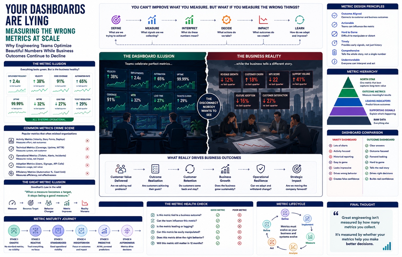
The slide deck opens with green.
Deployment frequency, up 340% year over year. Code coverage, 94%. Sprint completion rate, holding steady at 98% for six consecutive quarters. Uptime, four nines. The CEO clicks to the next slide, and there's more green — automation percentage, AI model accuracy, API call volume trending up and to the right like a hockey stick that never bends the other way.
"Our metrics have never looked better," she says, and she means it. She's not performing confidence. She has genuinely never seen a healthier-looking engineering organization in her career. The board nods. Someone asks a soft question about cloud spend, gets a soft answer, and the meeting moves on to the next agenda item.
Six months later, a different room. Same building, different mood.
Revenue is down 8% against forecast. Customer retention has slipped for three consecutive quarters — not catastrophically, but in the specific, compounding way that turns into catastrophe if nobody names it. Engineering velocity, by every internal measure, is still excellent. The dashboards are, if anything, greener than before. And nobody in the room can explain the gap between what the instruments say and what the business is doing.
This is the crime scene. Not a security breach, not an outage, not a scandal. Just a slow, quiet divergence between the numbers a company watches and the reality that company lives in. It is the most common failure mode in modern engineering organizations, and it is almost never investigated as a failure, because nothing on the dashboard ever turned red.
This is an investigation into why.
The First Crime Scene: What the Dashboard Didn't Say
Auditing an engineering dashboard is a strange kind of forensic work. You're not looking for what's wrong. Everything displayed is, technically, correct. Deployment frequency really did increase. Code coverage really is 94%. The lie isn't in the numbers. The lie is in the frame around them — in what got a chart and what didn't.
Here's what a healthy-looking dashboard at a mid-size SaaS company actually contained during one such audit:
- 14 engineering velocity and delivery metrics
- 9 infrastructure and reliability metrics
- 6 AI/ML performance metrics
- 3 security posture metrics
- 0 metrics connecting any of the above to a customer outcome
- 0 metrics connecting any of the above to a revenue outcome
- 1 metric — NPS — that touched the customer at all, updated quarterly, owned by a different team, and never displayed alongside engineering data
Nobody decided, in a meeting, to leave customer impact off the dashboard. That's the important part. No one voted against measuring what mattered. The omission was structural, not intentional. Engineering metrics get built by engineers, who have direct, immediate access to deployment logs, test suites, and infrastructure telemetry — and no equally immediate access to churn data, expansion revenue, or the qualitative reasons a customer opened a support ticket instead of just leaving. You measure what your instruments can see. Everything else becomes invisible by default, not by decision.
Three questions any dashboard audit should ask, and almost never does:
What wasn't measured? Not "what's missing from this chart" — what entire category of information never made it into the room. In this case: nothing about whether customers could accomplish their goals faster or slower than a year ago.
What assumptions were hidden inside each metric? "Deployment frequency" assumes that shipping more often is good. That assumption is usually true. It is not always true, and the dashboard has no mechanism for noticing when it stops being true.
What business questions were never asked because no metric existed to prompt them? This is the most expensive gap. A dashboard doesn't just fail to answer questions — it actively suppresses the ones it has no chart for. If there's no chart for "can a new customer complete onboarding without contacting support," nobody in the Monday leadership sync asks that question, because nothing on the wall reminds them to.
The dashboard wasn't lying about its contents. It was lying about its completeness. And completeness is the thing everyone assumes without checking.
The Metric Autopsy
Treat each metric like forensic evidence recovered from the scene. For each one: why leadership loved it, why engineers optimized it, and how it drifted from the business reality it was originally meant to represent.
Deployment Frequency Leadership loved it because it's an easy proxy for "engineering is moving fast," and it's comparable across teams, quarters, and competitors' public engineering blogs. Engineers optimized it because it's directly and immediately controllable — you can increase deployment frequency this afternoon by splitting a release into smaller pieces, with zero change to actual product value delivered. Drift: teams began shipping smaller, more frequent, more cosmetic changes specifically to keep the number climbing, while the changes that actually mattered — the ones requiring cross-team coordination, migration work, or careful rollout — got deprioritized because they hurt the weekly count.
Code Coverage Leadership loved it as a stand-in for "quality," a number that sounds like an audit passed. Engineers optimized it because coverage tools make the number trivially improvable — write a test that calls a function and asserts nothing meaningful, and coverage goes up. Drift: coverage climbed from 71% to 94% over eighteen months while production incident rates were flat. The tests existed. They didn't test anything anyone cared about.
Story Points / Velocity Leadership loved velocity because it looks like a forecasting tool — "if we did 40 points last sprint, we'll probably do 40 next sprint." Engineers optimized it because point inflation is invisible and costless: an 8 quietly becomes a 13 during estimation, and the team's "output" rises without a single extra hour of work. Drift: velocity became a number that measured how generously a team estimated its own effort, which is to say, it measured almost nothing.
Sprint Completion Rate Leadership loved the appearance of predictability — 98% completion looks like a well-run machine. Engineers optimized it by quietly padding sprints with low-risk, already-mostly-done work and pushing anything uncertain or ambiguous into a future sprint before it could threaten the number. Drift: the riskiest, highest-value work — the kind that's hard to estimate precisely because it's actually new — got systematically deferred, because deferring it protected the metric.
Active Users Leadership loved it as a growth signal investors ask about by name. Engineers and product optimized it with notification frequency, auto-triggered sessions, and re-engagement nudges that count as "activity" without indicating value. Drift: a user opening the app because a push notification interrupted them counts identically to a user opening the app to solve a real problem. The metric can't tell the difference, so the org stopped trying to.
API Calls Leadership loved it as a proxy for platform adoption. Engineers optimized it by, in more than one documented case, discovering that inefficient client-side code that made more redundant calls per session improved the metric leadership was watching, and nobody flagged the inefficiency because the dashboard was green.
Model Accuracy Leadership loved a single clean number that sounds scientific. Engineers optimized against a static validation set, sometimes for months after the real-world data distribution had shifted underneath it. Drift: accuracy on the frozen test set stayed at 96% while the model's real-world usefulness silently decayed, because nobody was measuring performance on live traffic with the same rigor.
Automation Percentage Leadership loved it as a cost-reduction and maturity signal. Engineers optimized it by automating the easy 80% of a process and declaring victory, leaving the hard, high-stakes 20% — the part that actually generated support tickets and escalations — untouched and unmeasured.
CPU Utilization Leadership loved low, stable utilization as evidence of efficient infrastructure. Engineers optimized it by over-provisioning, which drove utilization down and cloud cost up simultaneously — the metric improved while the thing it was supposed to be a proxy for (cost efficiency) got worse.
MTTR (Mean Time to Resolution) Leadership loved a shrinking number as evidence of operational maturity. Engineers optimized it by closing tickets faster with band-aid fixes and reopening them under new ticket IDs when the same issue recurred — which reset the clock and kept MTTR looking healthy while the underlying reliability problem never actually got resolved.
NPS Leadership loved it as "the" customer metric — single number, industry benchmark, board-slide-ready. It drifted because it's collected sporadically, skews toward whoever bothers to respond, and measures a customer's mood on one day rather than their trajectory over a relationship.
Revenue Growth Leadership loved it because it's the metric that ultimately justifies every other metric's existence. It drifted from engineering reality because revenue is lagging by design — it reflects decisions made a year ago, not the decisions being made this quarter, which means by the time it moves, the causes are already old news.
Retention Leadership loved it as the "real" growth metric, more honest than acquisition. It drifted because retention is an aggregate — it can hide a segment of customers churning hard while another segment masks the trend, and by the time the aggregate number moves, the specific, fixable cause is buried under a quarter of noise.
Every one of these metrics was accurate. Every one of them was also, eventually, gamed — not maliciously, but structurally, because a metric that can be improved without improving the underlying reality will be improved that way, given enough time and enough pressure to show progress. This isn't a story about bad actors. It's a story about incentives doing exactly what incentives do.
Hidden Witnesses
Every crime scene has witnesses who saw only part of what happened. Metrics work the same way. None of them lies outright — each one just tells a fragment of the truth, and organizations get in trouble when they mistake one witness's partial account for the whole story.
Leading Indicators speak in the future tense. They predict what's about to happen — deployment lead time, code review turnaround, error budget burn rate. Their weakness: they're only as good as the causal model behind them, and that model is rarely re-validated once built.
Lagging Indicators speak in the past tense. Revenue, churn, NPS. They're the most trustworthy witnesses and the least useful in the moment, because by the time they testify, the event is long over.
North Star Metrics claim to speak for the whole business in one sentence. Their weakness is that any single number that ambitious inevitably compresses ten different customer experiences into one line, and the compression itself becomes a source of blindness.
Proxy Metrics are witnesses who weren't actually at the scene — they heard about it secondhand. "Code coverage" is a proxy for quality. It's useful only as long as everyone remembers it's secondhand testimony, not a direct account.
Vanity Metrics are witnesses who love the sound of their own voice. They always have good news. That's the tell.
Behavior Metrics describe what people did, not why, and not whether it helped them.
Confidence Metrics — how sure a team is that a release is safe, how sure a model's prediction actually is — are rare in most organizations precisely because they're uncomfortable to collect. Nobody wants a dashboard that says "we're only 60% confident in this deploy," even though that number would be more useful than nine green checkmarks.
Outcome Metrics are the only witnesses who actually saw the crime — did the customer succeed at their goal? Most organizations have the fewest of these and trust them the least, because they're the hardest to instrument and the slowest to arrive.
Risk Metrics testify about what could go wrong, not what did. Underweighted everywhere, because they don't produce a satisfying green checkmark — only the absence of a red one, which is a much less compelling story to tell a board.
Reliability Signals — SLO burn rate, error budgets, incident recurrence — sit closest to outcome metrics but get treated like operational trivia instead of strategic evidence.
No single witness is lying. The investigation fails when leadership takes one category's testimony — usually leading indicators and vanity metrics, because they're the easiest to collect and the most flattering to report — and closes the case without ever calling the outcome metrics to the stand.
The Great Metric Illusion
There's a rule that governs almost everything in this investigation, first stated by economist Charles Goodhart and sharpened by anthropologist Marilyn Strathern into its now-famous form: when a measure becomes a target, it stops being a good measure.
It's not a cynical rule. It's closer to a law of physics. The moment a number determines a bonus, a promotion, or a board narrative, people — rationally, not maliciously — start optimizing the number instead of the reality it was built to represent. The measure and the reality, which used to move together, quietly decouple.
Here's how the decoupling looks across departments, in miniature.
QA. A team is measured on "bugs closed per week." Bugs closed per week goes up. So does the team's habit of closing bugs as "not reproducible" or "won't fix" rather than actually fixing them, because both count identically toward the number.
Platform Engineering. A team is measured on "infrastructure tickets resolved." Resolution time drops. So does the depth of each fix, because the fastest way to resolve a ticket is to patch the symptom and move to the next one before the underlying cause resurfaces on someone else's dashboard.
Cybersecurity. A team is measured on "vulnerabilities patched." The number climbs steadily. So does the team's incentive to patch low-severity, easy vulnerabilities first, because they're quick wins that inflate the count, while a small number of hard, high-severity issues sit untouched for months.
AI. A team is measured on "model accuracy on the benchmark." Accuracy climbs to 97%. So does quiet, incremental overfitting to that specific benchmark, invisible until the model meets real users and underperforms in exactly the situations the benchmark never tested.
Product. A team is measured on "features shipped per quarter." Feature count climbs. So does the product's surface area, its onboarding complexity, and its long-term maintenance burden — none of which show up in "features shipped," all of which show up eighteen months later in churn.
Sales. A team is measured on "deals closed." Deal count climbs. So does the rate of closing deals with customers who are a poor product fit, because a closed deal counts the same whether the customer renews or churns in month two.
Operations. A team is measured on "tickets resolved same-day." Same-day resolution climbs. So does the rate of tickets marked resolved that customers immediately reopen, because reopening a ticket doesn't subtract from last week's number.
Data Science. A team is measured on "models shipped to production." Shipped-model count climbs. So does the number of models nobody is monitoring six months later, quietly drifting, because "shipped" was the finish line the metric cared about, and nothing measured what happened after.
In every case, the team did exactly what the metric asked of them. That's what makes Goodhart's Law so dangerous — it doesn't require anyone to cheat. It only requires a metric to exist long enough for people to learn its shape.
Internal Slack Conversation — #eng-leadership, Thursday, 4:47 PM
Engineering (Priya): Quick win to share before EOD — deployment frequency doubled this quarter. 340 releases vs 160 last quarter. Team's been crushing it.
Product (Dan): Appreciate that, genuinely. Though — heads up — I was on three customer calls this week and two of them independently brought up the same complaint about the onboarding flow. Feels like it's been broken for a while?
Engineering (Priya): Huh, nothing's flagged on our end. All green across the board.
Support (Marcus): Ticket volume's up 22% month over month, mostly onboarding-related. Been meaning to raise this.
Finance (Aisha): Not to pile on, but revenue's flat against forecast for the second straight quarter. Board's going to ask about it Monday.
CEO (Wren): Genuinely trying to understand this. Deployments doubled. Support tickets went up. Customers are complaining about the exact thing engineering shipped changes to twice this month. Revenue is flat.
CEO (Wren): So... what exactly improved?
Engineering (Priya): …
Product (Dan): I don't think anyone's lying about their numbers. I think we're just all looking at different rooms in the same house.
That last line from Dan is the whole article in one sentence. Nobody in that thread falsified anything. Every number reported was true. And true numbers, reported honestly from four different rooms, added up to a CEO who could not answer a basic question about her own company.
Five Companies, Five Metrics, Five Ways to Fail
Company A — Velocity-Obsessed Every team's success is measured in story points closed per sprint. Velocity climbs 60% over a year. Leadership treats it as proof the org is "scaling engineering effectively." What actually happens: teams start splitting large, ambiguous, high-value work into artificially small tickets to protect their point totals, and stop taking on the hard architectural work that doesn't decompose neatly into two-day chunks. A year later, the codebase has more small features and less coherent architecture, technical debt has compounded, and the team that once shipped a major platform migration in a quarter now needs two — but velocity, the whole time, looked great.
Company B — Uptime-Obsessed Five nines, company-wide, is the metric that gets a Slack emoji celebration every time it's hit. Engineers respond exactly as incentivized: they slow the pace of change, add extra approval gates, and quietly deprioritize any feature work that carries deployment risk. Uptime stays excellent. Product innovation stalls, because the safest way to protect uptime is to ship less. Competitors ship faster and worse — and still win market share, because "the product barely changes but never goes down" is not what most customers were actually asking for.
Company C — AI-Accuracy-Obsessed The ML team is evaluated purely on model accuracy against a fixed validation set, refreshed twice a year. Accuracy holds at 96%+ for eighteen months straight — an impressive, dashboard-worthy run. Meanwhile the actual population the model serves has shifted: new user segments, new product usage patterns, new edge cases the validation set was never built to represent. Customer complaints about "the AI getting things wrong" rise steadily. The accuracy number never moves, because it was never measuring the thing customers were experiencing.
Company D — Automation-Obsessed "Percentage of processes automated" becomes the headline operational metric. It climbs from 40% to 85% in two years — a genuinely impressive engineering achievement on its own terms. But the automated 85% was the easy, low-stakes, high-volume work. The remaining 15% — edge cases, exceptions, unusual customer situations — is the part that actually drove escalations, and it stayed almost entirely manual and increasingly under-resourced, because leadership's attention had followed the metric, and the metric said the automation story was basically done.
Company E — Cost-Reduction-Obsessed Cloud spend per customer becomes the metric every engineering review opens with. It drops 30% in a year — a real, celebrated, bonus-triggering win. The mechanism: aggressive caching, reduced redundancy, and consolidated infrastructure that also, quietly, reduced the system's resilience margin. Eight months later, a traffic spike that the old, more expensively redundant architecture would have absorbed instead causes a multi-hour outage during a peak sales period. The cost-per-customer chart looked fantastic right up until the day it explained exactly why the outage happened.
Five companies. Five different metrics. One identical failure mode: each one picked a single number, watched it faithfully, and let it quietly replace the judgment it was originally supposed to inform.
The Dashboard Nobody Built
Every audit eventually asks: what should the dashboard have looked like? The honest answer isn't a better set of charts. It's a different set of questions.
Can customers accomplish their goals? Not "did they log in" — did they complete the thing they came to do, and how did the time-to-completion trend over the last two quarters?
Can engineers predict incidents before they happen? Not "how fast did we resolve the last one" — how often does the team's stated confidence in a release match what actually happens after it ships?
Can leadership trust releases without a war room on standby? Not "did the deploy succeed" — does the team believe, honestly, that this release is safe, and is that belief calibrated against its actual track record?
Can teams learn faster than the business changes underneath them? Not "how many retros did we run" — how often does a lesson from one incident actually change behavior on the next one?
Can risks be detected before a customer notices them first? Not "how many alerts fired" — what percentage of last quarter's customer-reported issues were things internal signals could have caught first, and didn't?
None of these render as a clean line chart. That's the point. The dashboard nobody builds is the one that trades a comforting, easy-to-read chart for an uncomfortable, harder-to-answer question — and most organizations, when forced to choose, choose comfort. Not out of laziness. Because comfort is measurable this afternoon, and the harder questions require building instrumentation that doesn't exist yet.
Thought Experiment: Delete Every Dashboard Tomorrow
Imagine every dashboard in the company disappears overnight. No warning. Gone.
What would engineering actually notice missing in the first week?
Almost certainly: nothing operational. On-call engineers would still get paged by real alerts wired directly into incident tooling, which mostly doesn't depend on the dashboard layer at all. Deploys would still happen. The system would keep running, because the dashboard was never actually load-bearing for keeping the system alive — it was load-bearing for keeping leadership informed, which is a different function entirely.
What would leadership notice missing in the first week? Everything. The weekly update deck would have no charts. The board narrative would have no evidence. And that gap — the fact that leadership's sense of organizational health depends entirely on a layer that operations barely touches — is itself the finding. The dashboard's real job, most of the time, isn't running the business. It's narrating the business to the people who aren't close enough to see it directly.
Which metrics would people quietly, immediately miss? The ones that changed a real decision in the last month — a capacity plan, a hiring call, a go/no-go on a release. Which would nobody miss? The ones that only ever appeared in a recap nobody acted on. That test — did this number change a decision in the last thirty days — is a faster audit than any framework, and it's brutal, because most dashboard metrics fail it immediately.
Invisible Feedback Loops
Organizations rarely choose, on purpose, to optimize for the wrong thing. They drift into it, one reasonable-seeming feedback loop at a time.
Executive approval. A metric that makes a leadership update look good gets featured again next time. A metric that raises hard questions gets quietly dropped from the deck "for time." Over a year, the deck itself evolves to contain only flattering numbers — not through censorship, but through a thousand small choices about what's worth a slide.
Quarterly reporting. Anything that can be measured and improved within a ninety-day window gets disproportionate attention, because it fits the reporting cadence. Anything that takes eighteen months to show up — architecture health, customer trust, technical debt — structurally loses the attention competition every single quarter, forever, regardless of how important it actually is.
Bonuses. Whatever's in the compensation formula gets optimized with the full creative force of every person whose pay depends on it. This isn't a character flaw. It's what a bonus formula is for. The mistake is assuming the formula and the mission are the same document.
Roadmaps. Roadmap items get built because they're plannable, estimable, and demoable — not necessarily because they're what customers most need. A roadmap slot is itself a kind of metric, and it optimizes for "things that fit neatly into a roadmap."
Planning rituals. Sprint planning, quarterly OKR-setting, annual budgeting — each ritual has its own internal logic and its own definition of a "good" outcome, and that internal logic, repeated often enough, becomes indistinguishable from the actual goal.
None of these loops are optimizing for customer value on purpose. They're optimizing for looking good inside the system that observes them — and a system that never checks its own observations against outside reality has no way of noticing the difference.
Engineering Economics: The Hidden Cost of the Wrong KPI
Every misoptimized metric has a bill, and the bill rarely arrives on the same dashboard that generated the charge.
Optimizing for faster releases without a matching investment in release confidence tends to show up later as higher cloud costs (rollback infrastructure, redundant environments to de-risk speed), higher support burden (more edge cases reaching production untested), more incidents (statistically inevitable at higher change volume without proportional safeguards), and developer burnout (the on-call rotation absorbs the risk the process didn't).
Optimizing for cost reduction without a matching investment in resilience tends to show up later as technical debt (shortcuts taken to hit a number), security debt (the audit deprioritized to save budget), and eventually customer churn (the outage that happened because the safety margin got cut along with the spend).
Optimizing for automation percentage without investment in the hard remaining cases tends to show up as concentrated developer burnout in whichever small team is left holding the manual, high-stakes 15% nobody automated, and as slowly rising customer churn among exactly the segment whose needs fell outside the automated path.
The pattern across all three: the cost of a misoptimized metric is almost always paid by a different line item, on a different dashboard, owned by a different team, months or quarters later. That time and ownership gap is precisely why the connection never gets made in a retro. Nobody connects Q1's velocity win to Q3's support cost spike, because by Q3, Q1's dashboard has already scrolled off everyone's screen.
Metric Design Principles
Rather than handing over another list of KPIs to copy, here are the questions worth asking before any new metric earns a permanent spot on a dashboard.
Does it predict a customer outcome, or does it just predict itself? A metric that only correlates with other internal metrics is measuring the machine, not the mission.
Can the team that owns it actually influence it? A metric nobody can move is either irrelevant to daily decisions or, worse, a source of quiet resentment when it's used to judge people anyway.
How easily can it be gamed without changing the underlying reality? If the answer is "trivially," the metric has a short, useful life ahead of it before it decouples from what it was meant to represent.
Does it reward the behavior you actually want, or the behavior that's easiest to fake? Coverage rewards writing tests. It doesn't reward writing tests that catch bugs. The gap between those two things is where most metrics quietly fail.
Will it still mean something in a year, or is it measuring this quarter's priorities dressed up as a permanent truth? Some metrics are legitimately situational — useful for one initiative, then retired. Treating a situational metric as permanent is how dashboards accumulate charts nobody remembers the original purpose of.
A useful shorthand for this whole exercise: every metric has a half-life — a point at which the behavior it was designed to encourage has been fully learned and gamed by the people it measures, after which its signal value decays toward zero. Some metrics have a half-life of years. Some have a half-life of one bad incentive cycle. Almost none have an infinite half-life, and almost every dashboard is full of metrics well past theirs.
Original Frameworks
The Engineering Signal Pyramid. At the base: raw telemetry — logs, traces, deploy events, ticket counts. The middle layer: derived operational metrics — MTTR, velocity, coverage. The top layer, the smallest and hardest to reach: validated business outcomes — did the customer succeed, did revenue respond, did trust increase. Most dashboards are built almost entirely from the wide base and the narrow middle, because those layers are cheap and immediate to instrument. The top of the pyramid is expensive, slow, and almost never gets built — which means most organizations are optimizing from a foundation that never actually reaches the point of the pyramid that matters.
The Confidence-to-Outcome Curve. Plot a team's stated confidence in a release against the release's actual outcome over many releases. A well-calibrated team's confidence tracks the diagonal — 80% confidence roughly means 80% of the time it goes well. Most teams' curves bow badly above the diagonal: they're consistently more confident than their track record justifies, because confidence is rarely measured and never checked against outcomes until something breaks it in public.
The False Confidence Gradient. A simple observation: the newer and more heavily automated a metric's collection pipeline, the more organizational confidence it commands, and the less that confidence is actually validated against reality. A hand-checked number gets challenged constantly. An automated dashboard chart gets trusted by default — right up until it's wrong for six months and nobody noticed, because trusting it was easier than questioning it.
The Outcome Gravity Model. Every metric exerts a "gravitational pull" on team behavior proportional to how visible it is and how directly it's tied to reward — not proportional to how important it actually is to the business. A vanity metric with a big chart and a bonus attached will out-pull a critical outcome metric buried in a spreadsheet nobody opens. Fixing measurement culture is less about adding better metrics and more about redistributing gravity toward the ones that were always more important.
The Signal Reliability Matrix. Plot every metric on two axes: how easily it can be gamed, and how directly it connects to a real customer or business outcome. The metrics worth defending sit in the low-gameability, high-outcome-connection quadrant — and that quadrant, in most audits, is nearly empty.
Predictions: How Measurement Changes With AI
As AI-generated code, autonomous agents, and continuous experimentation become normal parts of engineering work, the old scoreboard starts to break in a specific, predictable way: almost every legacy metric was built on the assumption that a human wrote the code, so human activity was a reasonable thing to measure as a proxy for progress. Commits, story points, deployment frequency — all of them quietly assume a person is the bottleneck.
Once an agent can generate, test, and even deploy code with minimal human involvement, activity-based metrics stop meaning anything. Deployment frequency stops being a signal of team effort and becomes a signal of how fast an agent is allowed to move — which tells you nothing about whether that speed is wise.
What replaces activity metrics won't be more activity metrics measured on agents instead of humans. It will have to be confidence and outcome metrics — because the thing that actually matters when a system can act autonomously is not "how much did it do" but "how sure are we that what it did was correct, and did that correctness hold up in the real world." Expect the next generation of engineering dashboards to foreground calibrated confidence scores, real-world outcome validation loops, and drift-detection between what a model or agent was trained to expect and what it's actually encountering — the same three concerns that already quietly undermine model-accuracy metrics today, just made unavoidable at agent scale.
Organizations that keep measuring AI-assisted engineering the way they measured human engineering — commits, PRs merged, "AI-generated code percentage" as its own vanity metric — will get exactly the same Goodhart's Law failure mode as Company A and Company C, just faster and with less human judgment in the loop to catch it.
An Executive Letter
To the CEOs, CTOs, and VPs of Engineering reading this on a plane between board meetings:
Your dashboard is probably telling the truth. That's not the problem. The problem is that it was built to be a reporting system — a way to summarize what already happened for people who weren't in the room — when what your organization actually needs is a decision-support system: something built to answer the specific question in front of you, right now, with enough honesty to include "we don't know" as a valid answer.
A reporting system rewards charts that always look presentable. A decision-support system rewards charts that are sometimes uncomfortable, because discomfort is often exactly the information you need before a decision, not after one.
The fix isn't a new BI tool. It's a cultural one: before your next metric earns a permanent slide, ask who would actually change a decision because of it, and what decision that would be. If no one can answer, you've found a reporting metric wearing a decision-support costume. Retire it, or demote it to an appendix nobody's compensation depends on.
Your job isn't to have the greenest dashboard in the industry. It's to have the one most likely to tell you the truth before your customers have to tell you first.
Closing Reflection
Every organization audited for this piece had smart people, real discipline, and dashboards that, chart by chart, were telling the truth.
None of that saved them, because the goal was never to collect more metrics. Metrics are cheap now — cheaper than they've ever been, with more instrumentation, more automation, more AI-generated summaries of AI-generated telemetry than any team could read in a lifetime. Collecting more of them doesn't buy clarity. It buys more green charts to hide behind.
The goal isn't to collect more metrics.
The goal is to understand reality before reality understands you.